Dallas flower florist
Redesign of a local flower shop website
About project
Dallas Flower Florist is a local Dallas-based florist that provides floral arrangements for special occasions. the business provides reliable delivery services throughout the United States and Canada same-day delivery.
As part of a UX/UI course project, the website was redesigned to address usability issues in navigation, product discovery, and checkout flow.
Target Users
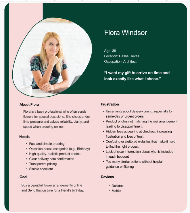
The target users of the Dallas Flower Florist website are adults who need to purchase flowers quickly for special occasions such as birthdays, anniversaries, or sympathy messages. These users are often time-constrained, may not have deep knowledge of floral arrangements, and rely on clear categories, visual guidance, and a smooth checkout experience to complete their purchase confidently.
Problem statement
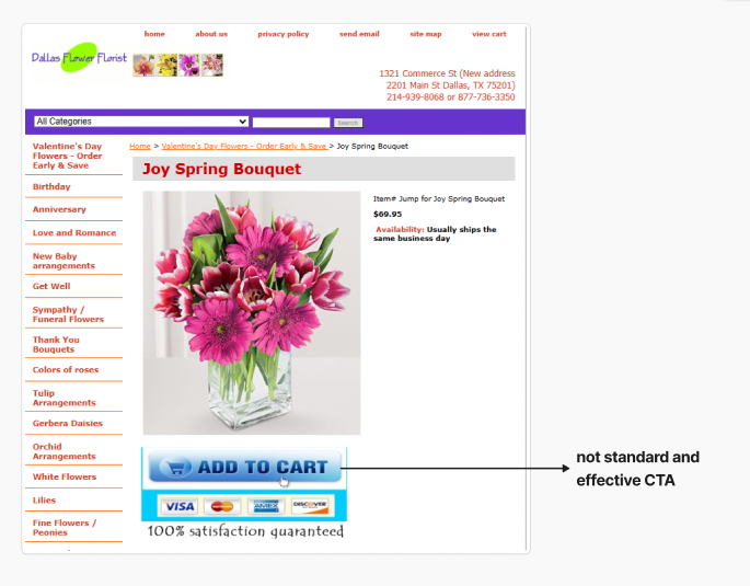
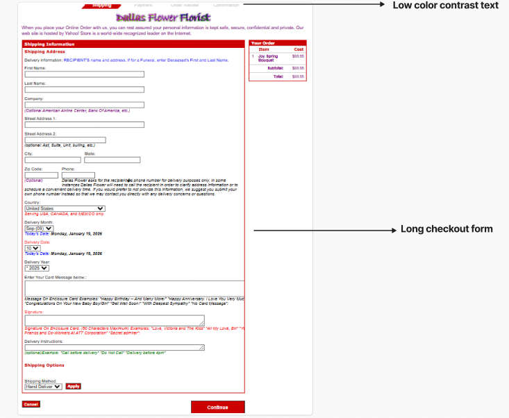
The existing flower shop website had usability issues that made it difficult for users to browse arrangements, select bouquets, and complete the checkout process. Additionally, the same-day delivery option was not clearly visible, causing many users to miss this feature. These issues created a confusing shopping experience and reduced the effectiveness of the website.
the Process
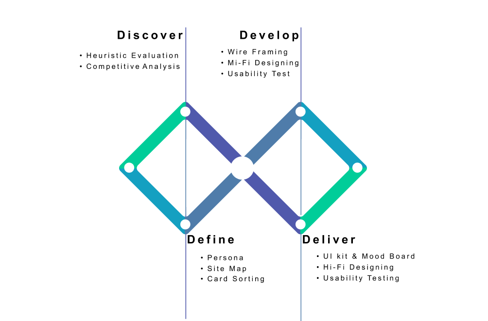

In the Discover phase, a heuristic evaluation and competitive analysis were used to identify usability issues, design gaps, and opportunities for improvement.
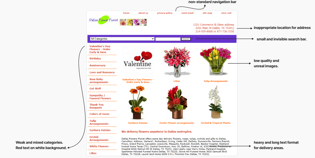
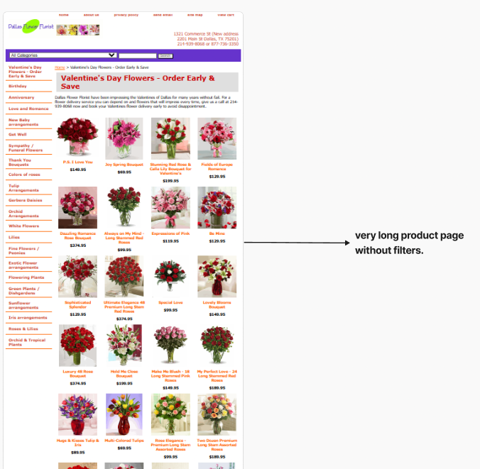
Heuristic evaluation
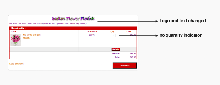
A heuristic evaluation was conducted to review the usability of the Dallas Flower Florist website using established UX principles. The assessment focused on core user tasks such as browsing products, understanding product information, and completing a purchase. This process revealed multiple usability issues related to navigation clarity, visual contrast, and checkout usability, which created friction and reduced user confidence during the shopping experience.
Competitive Analysis
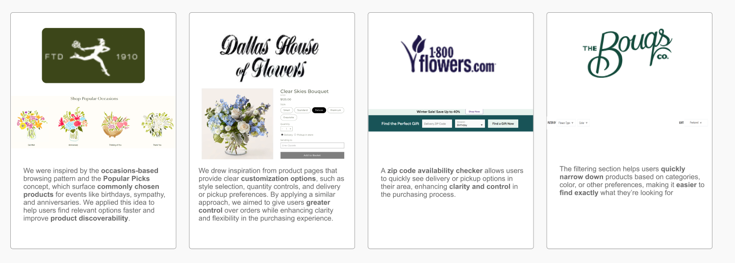
A competitive analysis was conducted using four florist websites to evaluate common design patterns, usability practices,customization options and filters within the industry. This review helped identify strengths, weaknesses, and gaps in the current market. The findings were used to guide design decisions and improve clarity, trust, and overall user experience in the final solution.

In this phase, personas, card sorting, user flows, and usability testing were used to clarify user needs, structure content, and identify key usability issues to guide the design direction.
Persona
Card Sorting
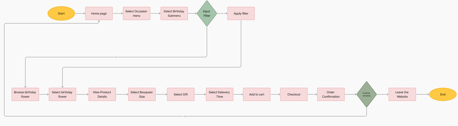
User Flow

Mid-Fidelity
Mid-fidelity wireframes were developed to organize layout, content hierarchy, and key user flows, allowing early usability validation before moving to high-fidelity design.


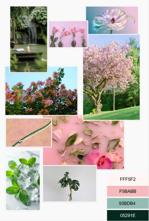
Moodboard
This moodboard captures a calm, natural, and celebratory atmosphere inspired by soft florals, organic textures, and fresh greenery. The palette reflects warmth, freshness, and emotional connection-supporting a joyful and thoughtful gifting experience.
UI kit
A consistent UI kit was created to define colors, typography, buttons, and components, ensuring visual consistency and a scalable design system across the interface.

Color accessibility
Color was evaluated to ensure sufficient contrast between text and background, improving readability and inclusivity for all users.

high-Fidelity
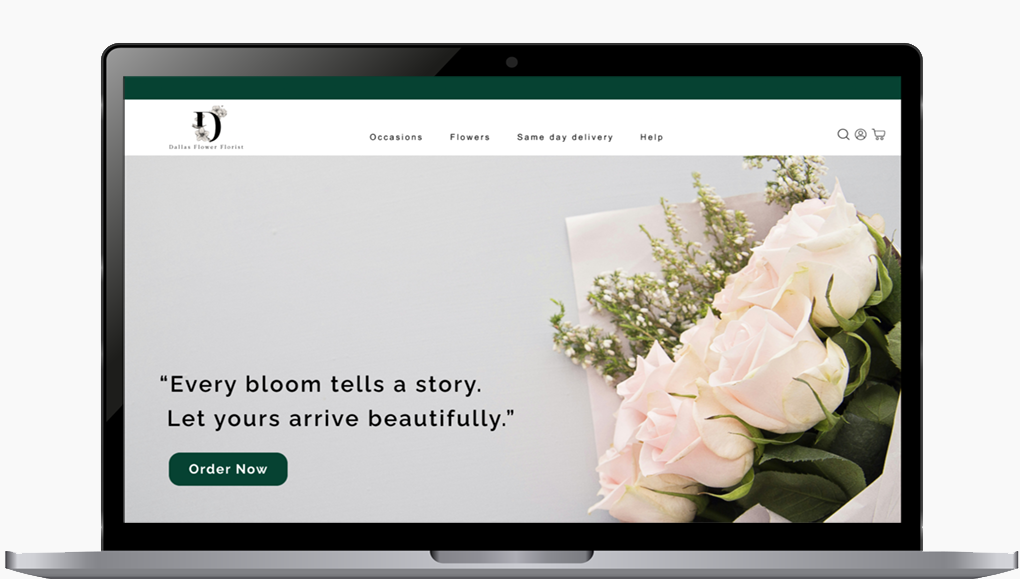
The final designs refine the wireframes with visual details such as typography, color, imagery, and spacing to create a polished and realistic user interface.
Home page
